Leduc community
hospital foundation
Designed with zag creative
Logo & Brand Design
Stationary Design
Brochure Design
Web Design
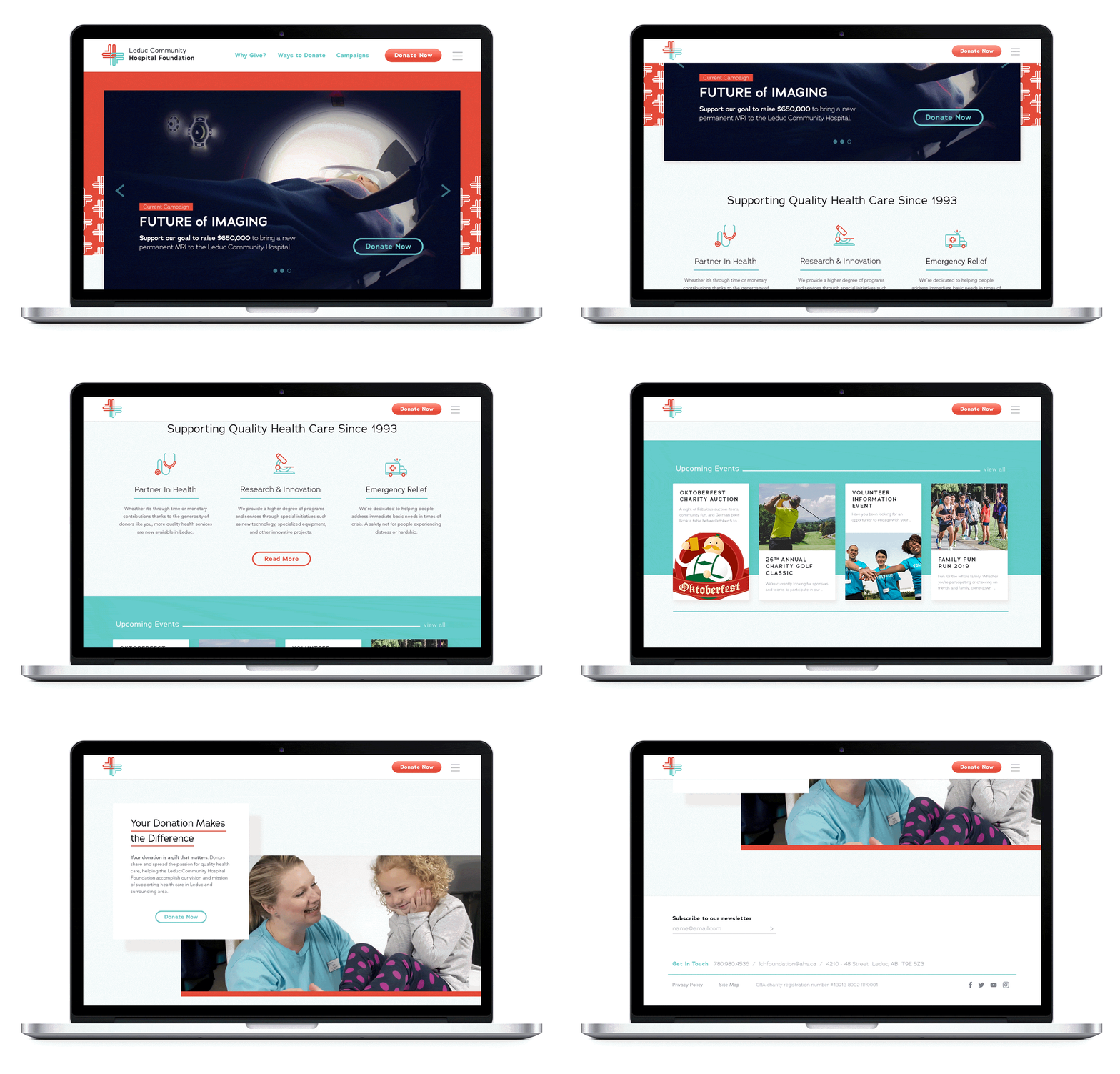
The Leduc Community Hospital Foundation is dedicated to enhancing services provided at their local health care facilities. The Foundation came to us seeking a full rebrand to modernize their image and emphasize a sense of professionalism, trust and community care.
The mark developed speaks to the community aspect of Foundation through the visual metaphor of woven forms coming together to create a solid and recognizable medical cross.
The colours reference medical illustrations of the circulatory system – reinforcing the vital role that the Foundation plays in the health of their community. The bright saturations of these colours paired with ample white spaces gives the brand a vibrant and optimistic feeling.
The type is set with a slightly loose tracking to create a feeling of openness and balance. While being clean and legible, subtle humanistic elements further reinforce the Foundation's caring, human-centred spirit.


