
Kayla Callfas

Kayla Callfas
Lady's Hat Farm
Identity Design
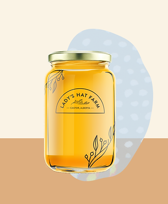
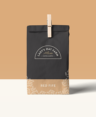
Brand Applications
Branded Illustrations
Lady's Hat Farm is a small scale farm, based on the edge of the Alberta Badlands, focused on farming food ecologically, thoughtfully and lovingly.
For this project I developed the brand identity and a variety of brand touch points ranging from packaging applications to branded illustrations.
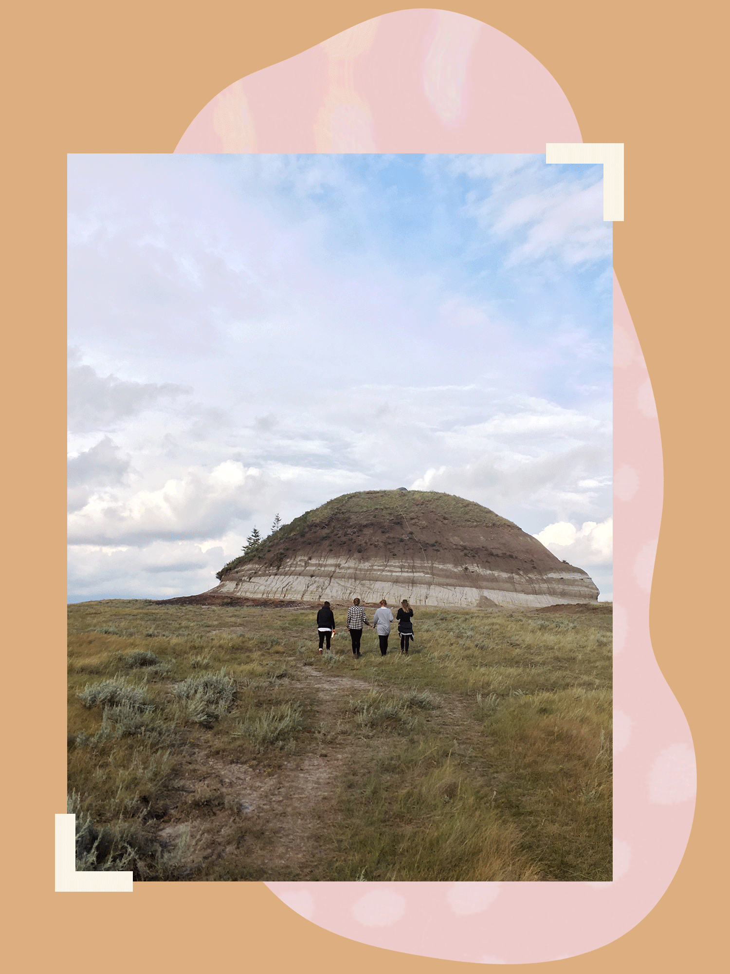
The form of the logo mimics the geographical formation that is the name sake of Lady's Hat Farm, a small, lone hill standing in the middle of the otherwise flat Prairie farmland. A clean and balanced san-serif typeface is used to compliment the overall geometric form of the logo. In the centre a small branch of sage is represented, drawing reference to the history of sage as a sacred plant used to purify and heal — just as Lady's Hat Farm seeks to do for their community through their farming practice.
The primary colour palette draws from the warm muted tones of the Prairie landscape while keeping a modern feel through its bold minimalism. A secondary palette of sky blue and pale pink are integrated into the brand to bring a sense of light, playfulness. This playfulness is further supported through the branded illustrations which use a whimsical collage style to highlight different products offered by Lady's Hat Farm.

Lady's Hat Farm is a small scale farm focused on providing nutritionally dense and ecologically grown products. Everything raised and grown at Lady's Hat Farm is done in a way that honours and revitalizes Mother Earth's beauty and bounty. Celebrating all that is natural, healthy, and good.
Packaging & Branded Applications

Branded ILLUSTRATIONS


